Our Visual Identity
Having trouble downloading? Please contact us.
Our Mission & Vision
Lumexo’s Mission
To simplify decentralized finance and give users direct, practical access to on-chain financial tools.
Lumexo’s Vision
A world where financial infrastructure is open, transparent, and controlled by the people who use it.
Logo use
The Lumexo logo can be used on both light and dark backgrounds to ensure versatility across different environments. Always choose a background that provides clear contrast and preserves logo visibility.
Primary Logo
The logo may also be used on light backgrounds such as #FFFFFF or #E2E2E2.
Primary White Logo
The white logo may also be used on light backgrounds such as #000533 or #0C1BA0.
Monochrome
Used when color printing is not available or when a simplified version is required.
The black logo is intended for light backgrounds, while the white logo is used on dark backgrounds to ensure optimal contrast and legibility.
Black Monochrome Logo
Used on light backgrounds for maximum contrast and legibility.

White Monochrome Logo
Flat Logo
The flat version of the Lumexo logo is used in minimal or digital-first applications where gradients are not suitable. It ensures clarity, simplicity, and consistent visibility across various screen sizes and backgrounds.


Primary Flat Logo
The flat logo may also be used on light backgrounds such as #FFFFFF or #E2E2E2.
Primary White Flat Logo
The white flat logo may also be used on light backgrounds such as #000533 or #0C1BA0.
Logomark
Our logomark is used for favicons, social media profiles, app icons, and other compact applications where the full logo cannot be displayed due to size constraints.


Primary Gradient Logomark
Used on light backgrounds such as #FFFFFF or #E2E2E2 for optimal visibility.
This version includes full color and gradient details, ideal for high-visibility applications.
Primary Flat Logomark
Used on brand backgrounds and solid colors such as #CBCBCD, #00052F, or #0B1891.
Simplified flat style ensures clarity at small sizes and in dark interfaces.
Co-branding
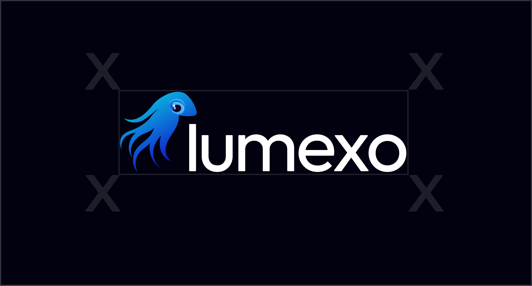
When placing the Lumexo logo alongside other brand marks, always maintain a clear and consistent safe zone equal to the height of the logomark (x) on all sides. This ensures proper spacing, prevents visual clutter, and preserves balance and legibility across all co-branded applications.
Logo Combinations
Examples of how partners can visually represent collaboration with Lumexo.
Lumexo Logotype + Partner Logo
Used to show partnership or integration with Lumexo.
Misuse
To maintain a consistent and professional brand presence, never alter, distort, or misuse the Lumexo logo in any way. The examples below illustrate incorrect applications that must be avoided.
Avoid stretching or skewing
Do not distort the logo’s proportions horizontally or vertically.
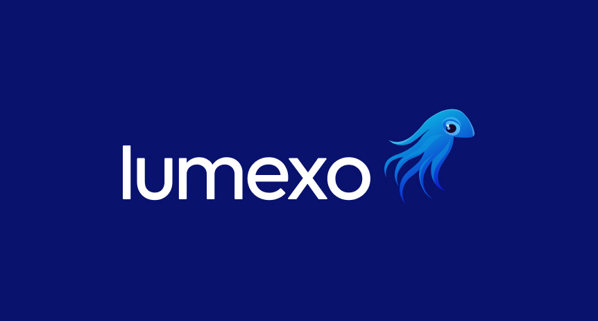
Avoid rearranging elements
Do not change the placement or spacing between the logomark and logotype.
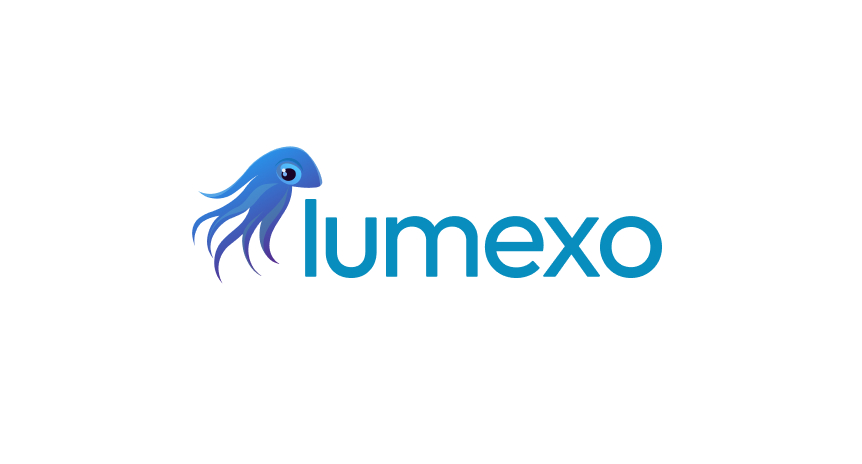
Avoid changing brand colors
Use only approved Lumexo colors; do not apply gradients or custom tones.

Avoid using colored backgrounds
Do not place the logo on backgrounds outside the approved brand palette.
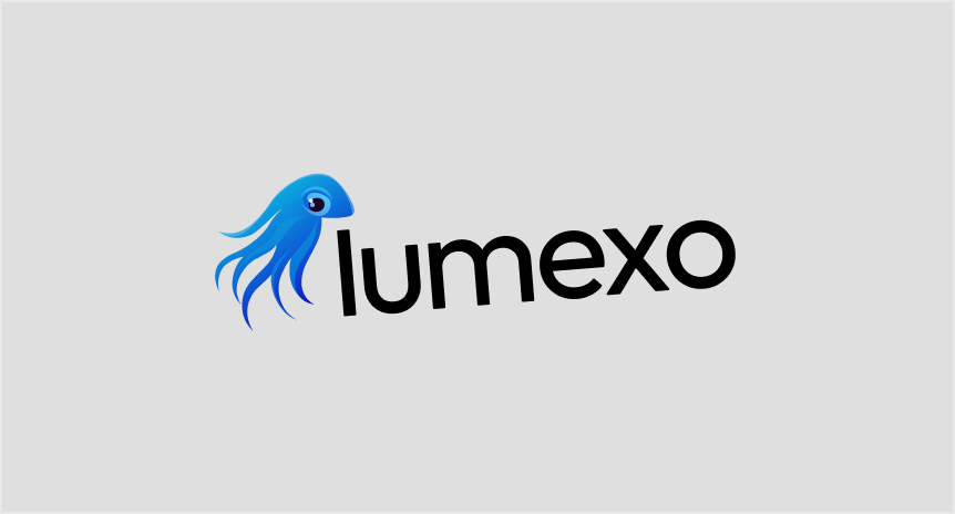
Avoid rotating
Keep the logo upright at all times.
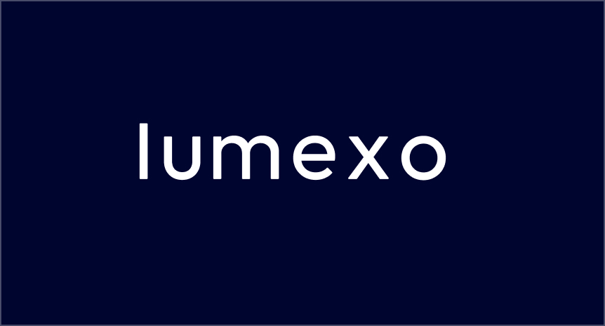
Avoid modifying the logo
Do not alter or remove any parts of the logomark or logotype.
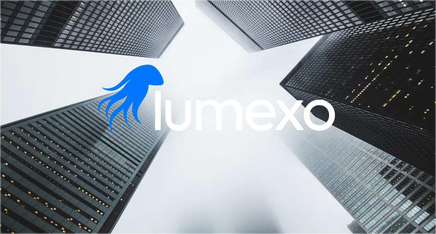
Avoid using logo on improper background
Do not place the logo over busy or photographic backgrounds that affect visibility.

Avoid using on low contrast background
Ensure sufficient contrast between the logo and its background for legibility.